Martha Rosler


In her performances, videos, textual works, photographs, and installations, Rosler confronts her audiences with political subjects and the role of the media, analyzing quotidian, domestic, and urban life from a feminist viewpoint not altogether devoid of humor. In her series, "Beauty Knows No Pain," or "Body Beautiful" (1965-74), she used techniques of collage to create a sense of unease with the ways in which women are portrayed. She has used this technique continuously, as in her well-known series of photomontages, "Bringing the War Home: House Beautiful," and "Bringing the War Home: In Vietnam" (1967-72).


This piece is commenting on the roles of women in the 1960s. It is boring and tedious to reflect the lives that housewives were expectedto live. A woman's role did not involve thought or further examination of her life. Rosler is throwing this in our faces! It’s so sarcastic and apparent

PAUL RAND

“Simplicity is not the goal. It is the by-product of a good idea and modest expectations.”
— PAUL RAND


PAUL RAND (BORN PERETZ ROSENBAUM, AUGUST 15, 1914 – NOVEMBER 26, 1996) was a well-known American graphic designer, best known for his corporate logo designs. Rand was educated at the Pratt Institute (1929-1932), the Parsons School of Design (1932-1933), and the Art Students League (1933-1934). He was one of the originators of the Swiss Style of graphic design. From 1956 to 1969, and beginning again in 1974, Rand taught design at Yale University in New Haven, Connecticut. Rand was inducted into the New York Art Directors Club Hall of Fame in 1972. He designed many posters and corporate identities, including the logos for IBM, UPS and ABC. Rand died of cancer in 1996.


“Should a logo be self-explanatory? It is only by association with a product, a service, a business, or a corporation that a logo takes on any real meaning. It derives its meaning and usefulness from the quality of that which it symbolizes. If a company is second rate, the logo will eventually be perceived as second rate. It is foolhardy to believe that a logo will do its job immediately, before an audience has been properly conditioned.”
IBM
Designed 1962
“A logo does not sell (directly), it identifies.”
UPS
Designed 1961
“I do not use humour consciously, I just go that way naturally. A well known example is my identity for United Parcels Service: to take an escutcheon – a medieval symbol which inevitably seems pompous today – and then stick a package on top of it, that is funny.”


Barbara Kruger


Kruger was heavily influenced by her years working as a graphic designer.

Kruger layers found photographs from existing sources with pithy and aggressive text that involves the viewer in the struggle for power and control that her captions speak to. In their trademark black letters against a slash of red background, some of her instantly recognizable slogans read “I shop, therefore I am,” and “Your body is a battleground.” Much of her text questions the viewer about feminism, classicism, consumerism, and individual autonomy and desire, although her black-and-white images are culled from the mainstream magazines that sell the very ideas she is disputing.


Identity

Identity is conceptualized as a broad biopsychosocial self-definition that includes the individual’s self-representation in the areas of physical functioning, thought, personality, relationships, occupation, and social roles broadly defined.

In recent decades, a new form of identification has emerged which breaks down the understanding of the individual as a coherent whole subject into a collection of various cultural identifiers. These cultural identifiers may be the result of various conditions including: location, gender, race, history, nationality, language, sexuality,religious beliefs, ethnicity and aesthetics. 

Modernism & Postmodernism

If defined in regards to time scale, Modernism is seen as the time before World War 2 and Post-Modernism after. If defined according to ideology, most definitions suggest that Postmodernism rejects the concept of advancement or progress in art.

Post-modernists believe that their work, their processes and their ideological values are contemporary, but in truth, they have their origins in the early 20th century. Specifically, their ideological values can be traced back to the work of Marcel Duchamp from 1913 to 1923. 
After the Second World War, such optimism in the future was difficult to sustain. And to make things worse, with the advent of the Cold War and the constant threat of nuclear destruction, any sort of future looked doubtful.
Having rejected the past many years ago, and now with the future no longer the goal of artistic effort, many artists turned with visible concern to the present and focused their attention on contemporary popular culture.
Popular culture, however, was undergoing a wild disruption during the sixties: the Civil Rights movement, opposition to the Vietnam war, the emergence of a widespread women's movement.
Pop artist could still appear progressive under these circumstances, contributing a critique of middle class ideals and the American dream (for example, Richard Hamilton).


Richard Hamilton
Just What Is It That Makes Today's Home So Different, So Appealing?
1956, Collage (Kunsthalle Museum, Tübingen, Germany)

Semiotics

Semiotics is the study of the action of a sign. There are two fundamental aspects of signs, signified over signifier. i.e. A sign in front of a restaurant with the text ‘Open’ is the signifier, while the signified concept is that the store is open for a business.
Visual processing is our primary sense; about 30% of our brain is involved in visual processing.
Semiotics is distinguished between three different sings
Icon, index and symbol
Whether the sign belongs in one category or another is dependent on the nature of the relationship between sign it self, which is Referent ad the actual meaning

Icon: is a sign that stands for an object by resembling it.  E.g., pictures, maps and diagrams.

Index: is referred to their objects, not by any virtual similarities relation but rather via the actual causal relation between the sign and its object. E.g. smoke is an index of a fire

Symbol: Refer to their objects, a representation of a learnt relationship. E.g. the colour red could mean love, hot, danger, stop and more
Letters alone have almost no interjecting meaning but when constructed in particular manner they have the ability to manifest the infinite amount of meanings.


Carl Warner

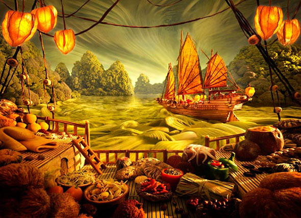
At first glance, these images look like painted landscapes. However, if you look little more carefully you will see that these are not paintings, but it is a juxtaposition of foods.
These pictures were photographed by Carl Warner, a photographer who works in London, and made specialty of these food landscapes ‘foodscapes’.
The process is very time consuming, and so the food quickly wilts under the lights but the end result is very impressive.
I feel in love with these photographs when I realized that it was made by using food.
“I tend to draw a very conventional landscape as I need to fool the viewer into thinking it is a real scene at first glance. It is the realization of what the real ingredients are that brings a smile, and for me that’s the best part.”


Description: Carl Warners Food Landscapes or FoodscapesDescription: Carl Warners Food Landscapes or Foodscapes

Nina Smart

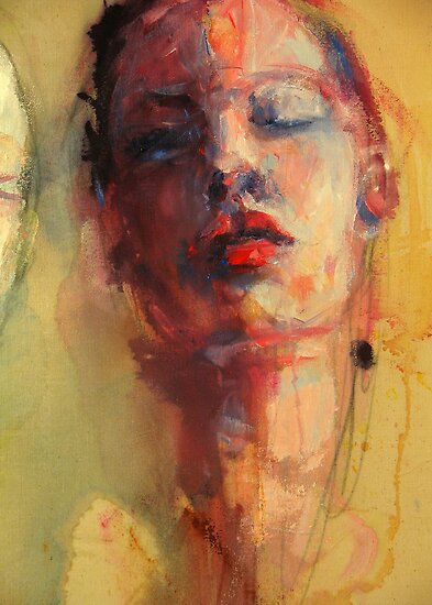
She is an artist from austrila she uses fluid acrylics and watercolours to express a personal perception of self and others and the changing nature of how we relate. I really liked her style she does gestural paintings but they are so expressive. You can feel the emotion and feelings just by looks at her art work which is a really good thing.

These are two of her painting that I liked, there are more but I just wanted to talk about these two in particular because the way it has been painted.
The subject of these two paintings are very near to similar but the way it’s been painted is different, even then the physiological effects to the viewer are same. 


Florian Nicolle

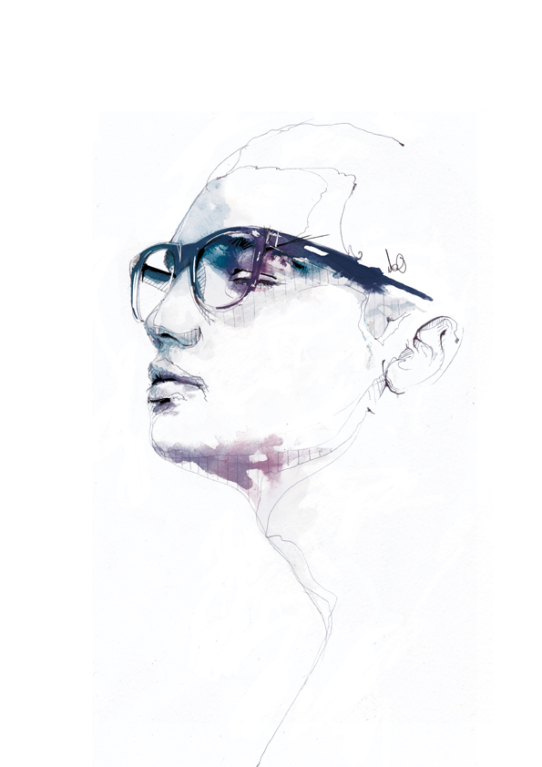
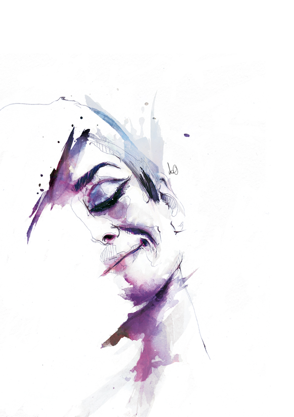
Florian Nicolle as known as (neo), French 24 year’s old graphic designer and illustrator,
He tries to create an image that retains its freshness of the first paint stroke, the expressions of the line have to be very free and spontaneous. While keeping a rigorous drawing. So i use fast techniques, like a bic, large brush, watercolour and chines ink.
I draw a picture as if I wrote a text, with the same tool, the same freedom, erasures, lines, scribbles
what I like about his work is that they are very detailed and unique.  Most of his works are painted on brown card/paper or newspaper. He doesn’t really use many colour in his painting but it looks stunning and detailed. He also uses computer software to give the traditional illustration that element which might not be possible without digital help. With the combination of both hand drawn and digital tweaks it really helps the artist to go up to the next level.
 I love the way he leaves some part of the painting unfinished it gives quite interesting finish to the painting and flows with the surface it is painted on.


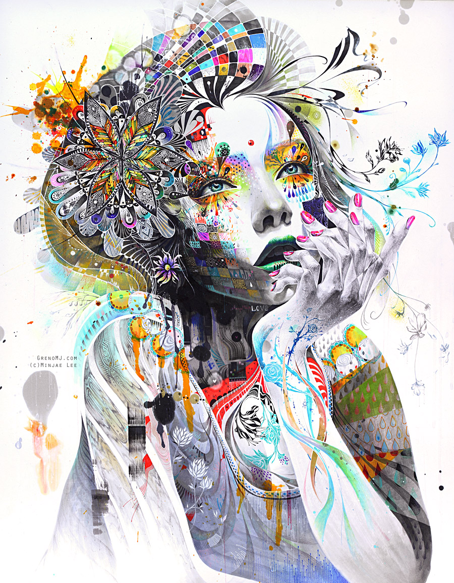
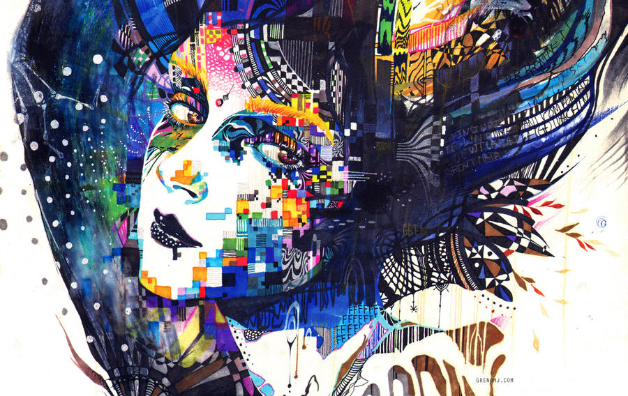
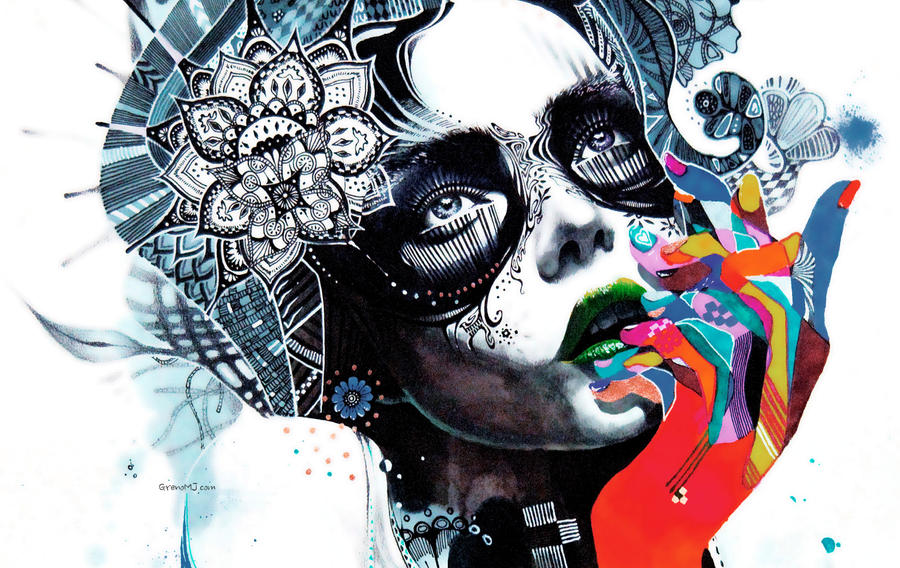
Minjae lee

Minjae lee, who is also known as MJ. He is an illustrator from Korea.
His works are really unique and inspiring as a student and illustrator. He always stuck to what he liked. The way he uses colours are unusual, he has always loved colour even though not many people didn’t like the way he uses colour, including his few teachers.
The vivid colour of markers, concept and the art work itself has always inspired me.
He loves using markers because of the vivid colour it produces; also he fins inspiration in human faces, abstract movement and colour.I love how he uses colours and patterns in the images it looks so much different and good. Most of his works are based on the human form and he makes it creative by using patterns and lots of bright colours.


The details, patterns and the way of using the colours makes this illustration stand out.  The composition of the object in the canvas looks just perfect. The dark blue/ light blue complements the bright yellow and orange colour, which makes the face interesting and stands out from the rest of the subject on the canvas.

But this one is bit different from the first image, even though he has used the same art elements. Despite the size and the details, the fingers/ hand is the one which caught my eye when I first saw this illustration because of the vivid block of colours, which makes the images interesting, also the strong dark colour in the face compliments the vivid colours.


Leonid Afremov


Leonid Afremov uses only palette-knife for painting. in his lifetime he tried lots of different techniques, but he especially fell in love with painting with oil and palette-knife. I really liked how he uses the hot and cold colour in the painting and because he uses palette knife to paint the strokes are really interesting and I love how he follows the tones and shapes of the subject

Most of his work consist nice environment of colours, trees, night lights and pathways
He also does portraits and still life. 


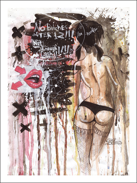
Lora Zombie (chosen Artist)

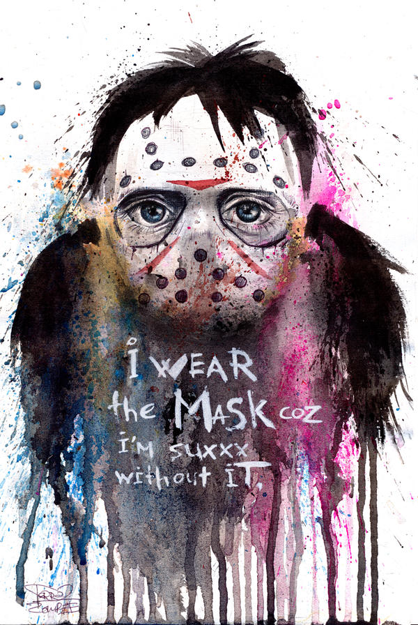
Lora Zombie is a young self-taught artist from Russia who has amassed a massive following of fans online over the past few years. Now she is breaking into the gallery scene and is branching far outside her native Russia.
She is quite an interesting illustrator, the use of half tone and vivid colours are noticeable in most of her work. A very skilled water colour and ink artist, also very strong concept is what attracted me towards her work, also the use of colour drips and splatters.
She has been the most influential artist on my illustration style.


http://lora8.deviantart.com
http://lorazombie.com